Android P 9.0: Name, Release Date, New Features & More
The Google I/O 2018 developer conference was a mixed bag of awesomeness with a pinch of creepiness. From the amazing thing Duplex promises in the near future to the AI centric approach Google as a corporation is heading towards, the Google I/O 2018 developer conference was a true window to our future and like any time traveling experience, it has left more unanswered questions from a human standpoint.
The Digital Twin subsuming all the amusement of the onlookers present at the conference is defining moment for Machine-Human interaction that promises a more machine dependent humanity which now stands at the crossroads where traditional mundane jobs will now be finally outsourced to machines.
Time will better unveil the after effects of this digital twin. However, for the time being, we look at another big announcement of the day which is the unveiling of the first Android P beta preview after the oreo update last year.
The developer preview promises intelligent gesture features coupled with new UI changes, features, and under-the-hood goodies to make your smartphone more efficient and a little longer battery life than earlier.
In this blog, you get to know all the ins and outs of the new Android P Beta currently released primarily for Pixel devices.
Google is all set to introduce the new version of its Android OS in the coming months. Meanwhile, the talks about the possible name for the next Android are ongoing.
As of now, we know this much that the next Android will be called ‘Android P’ following the naming trend by Google. However, what will that ‘P’ denote is still a mystery. It is also a common knowledge that the next Android, same as all the previous versions, is likely to be named after a popular dessert, starting with the letter P in this case.
Android P Name Suggestions
In order to ease the mystery around the name, we have come up with some of the most likely names that the Android P may be launched with. Have a look at some of the Android P Name suggestions:
- Android 9.0 Petit Four
- Android 9.0 Pound Cake
- Android 9.0 Pastille
- Android 9.0 Popsicle
- Android 9.0 Pancake
- Android 9.0 Profiterole
- Android 9.0 Puff Pastry
- Android 9.0 Pecan Pie / Pumpkin Pie / Anything Else In a Pie
If you have some good suggestion for this Android update then comment us and we will add in our list.
Release Date
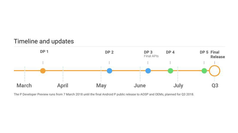
The final announcement is scheduled for later this year, with 3 more beta builds anticipate before a final release in Q3.
(SOURCE): Jason Cipriani/ZDNet
Read Also: How To Install Android P or roll back to oreo on your Pixel phone
List of devices Getting Android P
At this stage, the new Android P beta is available for the Pixel devices (Pixel, Pixel XL, Pixel 2, Pixel 2 XL) and seven other OEM devices from OnePlus, Nokia, and more. Putting the Pixel UI on a non-Pixel device is not possible as each OEM has built the Android P beta with its own manufacturer skins in mind.
If you want to enroll your Google pixel phone in Android P beta preview then you can download the preview version from this URL and system images form this URL.
Read Also : How To Install Android P or roll back to oreo on your Pixel phone
New Features in upcoming Android 9.0
Gesture Driven Navigation System
With Android P, Google has done away with its conventional navigation buttons. The user experience is intuitive and you will hardly take time before you come at ease with the gesture-driven navigation system. In four long yet easy steps, a user can enable gestures in his/her device. Follow these steps to use gestures on your device: go to Settings > System > Gestures > Swipe up on the home button.
Once enabled, users will notice that the traditional navigation buttons — home, back, and recent apps have disappeared from the screen. What appears now is a single elongated button placed right at the center of the user’s screen. This single elongated button subsumes in itself all the functionalities performed separately but the previous navigation buttons.
- To go to home just tap this button once.
- For Google Assistant just press the button a little longer than usual.
- A back button will automatically appear whenever there is a need to go back
A Child’s play, isn’t it?
But wait for a while now because things change when the user tries to access recently used apps or even the app drawer. What we believe is Google’s roadmap ahead for Android updates is building a smart cohesive environment where the smartphone is now an extension of you and caters to your need in a smarter yet intuitive way. This is explained by the following point below:
Accessing the App Drawer
Step1: Swipe up on the home button, and swipe up again
Or
Step2: Do one long swipe upwards
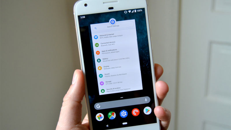
On doing swiping up from the home button, user’s will be introduced to a new screen which Google calls ‘The Overview’. In earlier versions, users were subjected to a big list of installed apps. Users either had to swipe around or manual search for specific apps. The Overview completely changes the playing field in this regard.
The Overview Screen in addition to the most recently used apps and the traditional Google Search Bar will also show five apps aligned horizontally at the bottom. Google’s guess is that these five apps are most likely to be used by you next. Hence, Google hopes to save important user time spent in mundane navigation in the app drawer screen.
Post opening the Overview screen, users can swipe left to view the recently opened apps. Further for quick navigation, as part of a smart gesture called Quick Scrub, users can even pull the home button towards left and quickly navigate through their apps. Quick Scrub supports multitasking, users can open their app drawer as well as perform google search irrespective of what they are doing on their phones.
AI-powered Longer lasting Battery
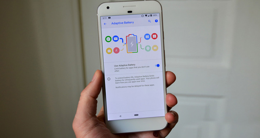
Android P, comes with a handful of machine learning driven features that ensure that the battery that powers the user’s phone, is not drained by seldomly used apps. There are two features for this: Adaptive Battery and Adaptive Brightness to improve battery life of your smartphone.
Adaptive Battery
Google acquired DeepMind, an AI company, in 2014. The Adaptive Battery is an outcome of this partnership and Android users must expect a whole lot of cool AI features on their devices in near future. Google in near times will be pulling out a whole lot of Rabbits from its Hat.
Powered by Machine Learning algorithms, Android P now uses real-time on-device techniques to keep dormant apps on your devices at bay from consuming precious battery. Battery efficiency is now powered by AI and Google calls this feature as Adaptive Battery. This feature will make three important assumptions:
- The APPs which are next in line to be opened by the user.
- The Apps which are rarely opened by the user.
- The Apps which are never opened by the user.
Google claims a reduction of 30% in CPU wake-up calls post the implementation of this ML feature.
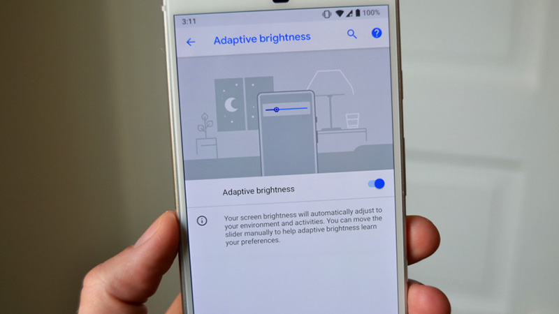
Adaptive Brightness
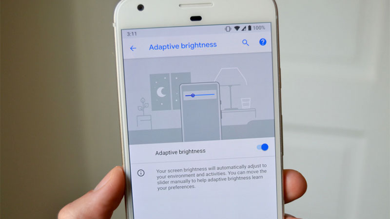
Till now ambient light sensors were used in smartphones to maintain desired brightness levels depending on the surround lightning conditions. However, thanks to ML and AI again, Adaptive Brightness has this creepy yet awesome ability to gain insights into the user’s brightness preference.
Adaptive Brightness makes the guess over a period of time by analyzing users activity of adjusting the brightness levels manually via the slider. The easy on the eye brightness level is decided not just on the environment but preferences recorded over a considerable time period.
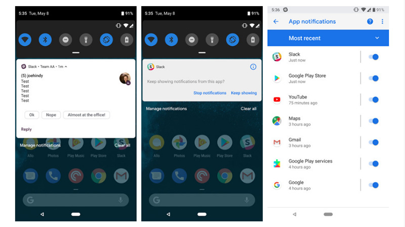
Smarter notifications
Are you fed up with non-relevant notifications?. Worry not my friend Android will now automatically dismiss such notifications and prevent users from viewing them.
For fine-tuned preferences, users can now use the Manage Notifications Button ( Placed at the bottom of the notification shade) to turn off nagging notifications.
Less is More: App Actions and Slices
With the introduction of App Actions and Slices features, Google is treading new ambitious lines in user interface design and experience. With Action and Slices, Google uses the prowess of its most critical tool ‘The Search’ to provide an efficient and less tedious environment to the user.
Actions and Slices will enable third-party apps and visual design to navigate certain specific parts of the Android OS particularly the search and Google Assistant with ease.
In layman term, Actions and Slices will give users the ability to easily navigate to deeper and frequently used functions at the touch of a button or a voice command. Google claims that actions can be created for any third-party app and they will reside within Assistant, in the Play Store, within Android P’s search bar, as well as customized buttons on the user’s home screen.
Let’s say a user frequently talks to his parents in another city after retiring from his daily chores including office and dinner. What Actions will do is that after a certain period of time, it might automatically make a small shortcut suggestion in the app drawer as a reminder for the user to call his/her parents.
Slices, on the other hand, are UI designs from third-party apps that are for the time being limited to the Android P search bar. For example, if you are ordering food online and you type order food in the search bar, Android will automatically surface the icon of the food app in addition to other apps related to the search. Actions and Slices are two core features aimed primarily to ease constant switching between apps and perform frequent user task in minimal steps.
Promised Features
Accountability was the dominant theme at this year’s Google I/O conference. Google it seems is trying to redefine what data does for the user. Instead of just being a consumer for companies, Google hopes to reorganize the data from users and help in solving user problems.
As a part of its Digital Wellbeing roadmap for the future, Google will empower its users to better understand their smartphone usage patterns and even cut back their usage if they desire to do so.
The Android P (not the Beta version) will carry three features which reflect the Google’s vision of the future that reshapes our relationships with smart devices and makes the user in charge of his preferences and activities rather than the other way around as has been the trend so far.
- Android Dashboard
- Shush mode
- App Timers
Dashboard
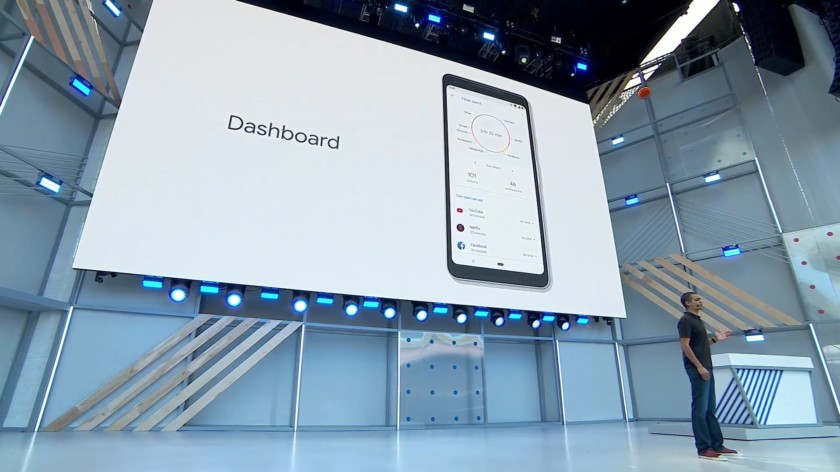
The Dashboard will be making its debut as a new section in the settings menu. The Dashboard reflects the statement made by Mr. Pichai, CEO Google while kicking off the annual Google I/O developer conference. Mr. Pichai stressed that Google as a company cannot just be wide-eyed about what we create.
There are very real and important questions being raised about the impact of technology and the role it will play in our lives. Android Dashboard perfectly resonates with Google’s efforts to build a technology ecosystem that fosters digital wellbeing. With Android Dashboard users will exactly know:
- Total Time of the Day spent on the phone.
- Total User time spent on using a particular app.
- The activity record of each app.
- The total number of times the device was unlocked.
- Total number notifications received.
Based on the above insights users can decide and Android P will enable users to regulate the amount of time spent on specific apps. Users can set time cappings and get notified by Google on crossing the time-cap. Google will gray out the app icon on your screen post the completion of a set time limit.
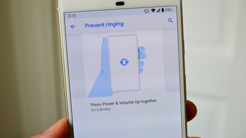
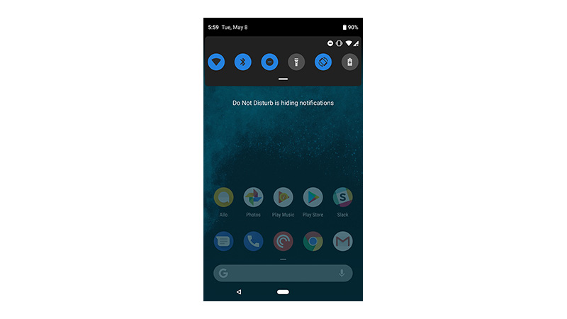
Also, there will be a new mode in addition to the default modes i.e The Do Not Disturb Mode. By activating this mode, your phone will stop being destructive to you and let you concentrate on the important piece of work at hand or even enjoy a seclusive moment. It would neither vibrate nor would any notifications appear on the lock screen.
The Shush Feature
With the Shush Feature, the moment a user will turn his/her phone over it will go into The Do Not Disturb Mode. This is as easy as it can get. Hence the next time you are in the middle of a meeting or something more important, all you need to do is turn your phone screen-down.
The Wind Down feature is for millions of us who now suffer from the Mobile phone overuse a kind of dependence syndrome. The Wind Down feature makes the smartphone to enter grayscale or monochrome mode. This mode ensures that user experience is boring and difficult by turning everything on your phone to grayscale and in the process help users to check on their disorder and possible addiction.
In conclusion, we can say that Google’s initiative to confront the two ghosts of the digital age i.e User Privacy and Smartphone Addiction is a commendable step ahead. It is high time that other digital solution providers understand the gravity of the situation and follow suit. However, these are still child steps when we consider the data security issue that currently lingers over each and every human being on the planet.
Android P 9.0: Name, Release Date, New Features & More
http://www.blog.sagmart.com/wp-content/uploads/2018/05/best-android-p-beta-300x300.jpg Technology Android P,Android P namesThe Google I/O 2018 developer conference was a mixed bag of awesomeness with a pinch of creepiness. From the amazing thing Duplex promises in the near future to the AI centric approach Google as a corporation is heading towards, the Google I/O 2018 developer conference was a true window to our future and like any time traveling experience, it has left more unanswered questions from a human standpoint.
The Digital Twin subsuming all the amusement of the onlookers present at the conference is defining moment for Machine-Human interaction that promises a more machine dependent humanity which now stands at the crossroads where traditional mundane jobs will now be finally outsourced to machines.
Time will better unveil the after effects of this digital twin. However, for the time being, we look at another big announcement of the day which is the unveiling of the first Android P beta preview after the oreo update last year.
The developer preview promises intelligent gesture features coupled with new UI changes, features, and under-the-hood goodies to make your smartphone more efficient and a little longer battery life than earlier.
In this blog, you get to know all the ins and outs of the new Android P Beta currently released primarily for Pixel devices.
Google is all set to introduce the new version of its Android OS in the coming months. Meanwhile, the talks about the possible name for the next Android are ongoing.
As of now, we know this much that the next Android will be called ‘Android P’ following the naming trend by Google. However, what will that ‘P’ denote is still a mystery. It is also a common knowledge that the next Android, same as all the previous versions, is likely to be named after a popular dessert, starting with the letter P in this case.
Android P Name Suggestions
In order to ease the mystery around the name, we have come up with some of the most likely names that the Android P may be launched with. Have a look at some of the Android P Name suggestions:
- Android 9.0 Petit Four
- Android 9.0 Pound Cake
- Android 9.0 Pastille
- Android 9.0 Popsicle
- Android 9.0 Pancake
- Android 9.0 Profiterole
- Android 9.0 Puff Pastry
- Android 9.0 Pecan Pie / Pumpkin Pie / Anything Else In a Pie
If you have some good suggestion for this Android update then comment us and we will add in our list.
Release Date
The final announcement is scheduled for later this year, with 3 more beta builds anticipate before a final release in Q3.
(SOURCE): Jason Cipriani/ZDNet
Read Also: How To Install Android P or roll back to oreo on your Pixel phone
List of devices Getting Android P
At this stage, the new Android P beta is available for the Pixel devices (Pixel, Pixel XL, Pixel 2, Pixel 2 XL) and seven other OEM devices from OnePlus, Nokia, and more. Putting the Pixel UI on a non-Pixel device is not possible as each OEM has built the Android P beta with its own manufacturer skins in mind.
If you want to enroll your Google pixel phone in Android P beta preview then you can download the preview version from this URL and system images form this URL.
Read Also : How To Install Android P or roll back to oreo on your Pixel phone
New Features in upcoming Android 9.0
Gesture Driven Navigation System
With Android P, Google has done away with its conventional navigation buttons. The user experience is intuitive and you will hardly take time before you come at ease with the gesture-driven navigation system. In four long yet easy steps, a user can enable gestures in his/her device. Follow these steps to use gestures on your device: go to Settings > System > Gestures > Swipe up on the home button.
Once enabled, users will notice that the traditional navigation buttons — home, back, and recent apps have disappeared from the screen. What appears now is a single elongated button placed right at the center of the user’s screen. This single elongated button subsumes in itself all the functionalities performed separately but the previous navigation buttons.
- To go to home just tap this button once.
- For Google Assistant just press the button a little longer than usual.
- A back button will automatically appear whenever there is a need to go back
A Child’s play, isn’t it?
But wait for a while now because things change when the user tries to access recently used apps or even the app drawer. What we believe is Google’s roadmap ahead for Android updates is building a smart cohesive environment where the smartphone is now an extension of you and caters to your need in a smarter yet intuitive way. This is explained by the following point below:
Accessing the App Drawer
Step1: Swipe up on the home button, and swipe up again
Or
Step2: Do one long swipe upwards
On doing swiping up from the home button, user’s will be introduced to a new screen which Google calls ‘The Overview’. In earlier versions, users were subjected to a big list of installed apps. Users either had to swipe around or manual search for specific apps. The Overview completely changes the playing field in this regard.
The Overview Screen in addition to the most recently used apps and the traditional Google Search Bar will also show five apps aligned horizontally at the bottom. Google’s guess is that these five apps are most likely to be used by you next. Hence, Google hopes to save important user time spent in mundane navigation in the app drawer screen.
Post opening the Overview screen, users can swipe left to view the recently opened apps. Further for quick navigation, as part of a smart gesture called Quick Scrub, users can even pull the home button towards left and quickly navigate through their apps. Quick Scrub supports multitasking, users can open their app drawer as well as perform google search irrespective of what they are doing on their phones.
AI-powered Longer lasting Battery
Android P, comes with a handful of machine learning driven features that ensure that the battery that powers the user’s phone, is not drained by seldomly used apps. There are two features for this: Adaptive Battery and Adaptive Brightness to improve battery life of your smartphone.
Adaptive Battery
Google acquired DeepMind, an AI company, in 2014. The Adaptive Battery is an outcome of this partnership and Android users must expect a whole lot of cool AI features on their devices in near future. Google in near times will be pulling out a whole lot of Rabbits from its Hat.
Powered by Machine Learning algorithms, Android P now uses real-time on-device techniques to keep dormant apps on your devices at bay from consuming precious battery. Battery efficiency is now powered by AI and Google calls this feature as Adaptive Battery. This feature will make three important assumptions:
- The APPs which are next in line to be opened by the user.
- The Apps which are rarely opened by the user.
- The Apps which are never opened by the user.
Google claims a reduction of 30% in CPU wake-up calls post the implementation of this ML feature.
Adaptive Brightness
Till now ambient light sensors were used in smartphones to maintain desired brightness levels depending on the surround lightning conditions. However, thanks to ML and AI again, Adaptive Brightness has this creepy yet awesome ability to gain insights into the user’s brightness preference.
Adaptive Brightness makes the guess over a period of time by analyzing users activity of adjusting the brightness levels manually via the slider. The easy on the eye brightness level is decided not just on the environment but preferences recorded over a considerable time period.
Smarter notifications
Are you fed up with non-relevant notifications?. Worry not my friend Android will now automatically dismiss such notifications and prevent users from viewing them.
For fine-tuned preferences, users can now use the Manage Notifications Button ( Placed at the bottom of the notification shade) to turn off nagging notifications.
Less is More: App Actions and Slices
With the introduction of App Actions and Slices features, Google is treading new ambitious lines in user interface design and experience. With Action and Slices, Google uses the prowess of its most critical tool ‘The Search’ to provide an efficient and less tedious environment to the user.
Actions and Slices will enable third-party apps and visual design to navigate certain specific parts of the Android OS particularly the search and Google Assistant with ease.
In layman term, Actions and Slices will give users the ability to easily navigate to deeper and frequently used functions at the touch of a button or a voice command. Google claims that actions can be created for any third-party app and they will reside within Assistant, in the Play Store, within Android P’s search bar, as well as customized buttons on the user’s home screen.
Let’s say a user frequently talks to his parents in another city after retiring from his daily chores including office and dinner. What Actions will do is that after a certain period of time, it might automatically make a small shortcut suggestion in the app drawer as a reminder for the user to call his/her parents.
Slices, on the other hand, are UI designs from third-party apps that are for the time being limited to the Android P search bar. For example, if you are ordering food online and you type order food in the search bar, Android will automatically surface the icon of the food app in addition to other apps related to the search. Actions and Slices are two core features aimed primarily to ease constant switching between apps and perform frequent user task in minimal steps.
Promised Features
Accountability was the dominant theme at this year’s Google I/O conference. Google it seems is trying to redefine what data does for the user. Instead of just being a consumer for companies, Google hopes to reorganize the data from users and help in solving user problems.
As a part of its Digital Wellbeing roadmap for the future, Google will empower its users to better understand their smartphone usage patterns and even cut back their usage if they desire to do so.
The Android P (not the Beta version) will carry three features which reflect the Google’s vision of the future that reshapes our relationships with smart devices and makes the user in charge of his preferences and activities rather than the other way around as has been the trend so far.
- Android Dashboard
- Shush mode
- App Timers
Dashboard
The Dashboard will be making its debut as a new section in the settings menu. The Dashboard reflects the statement made by Mr. Pichai, CEO Google while kicking off the annual Google I/O developer conference. Mr. Pichai stressed that Google as a company cannot just be wide-eyed about what we create.
There are very real and important questions being raised about the impact of technology and the role it will play in our lives. Android Dashboard perfectly resonates with Google’s efforts to build a technology ecosystem that fosters digital wellbeing. With Android Dashboard users will exactly know:
- Total Time of the Day spent on the phone.
- Total User time spent on using a particular app.
- The activity record of each app.
- The total number of times the device was unlocked.
- Total number notifications received.
Based on the above insights users can decide and Android P will enable users to regulate the amount of time spent on specific apps. Users can set time cappings and get notified by Google on crossing the time-cap. Google will gray out the app icon on your screen post the completion of a set time limit.
Also, there will be a new mode in addition to the default modes i.e The Do Not Disturb Mode. By activating this mode, your phone will stop being destructive to you and let you concentrate on the important piece of work at hand or even enjoy a seclusive moment. It would neither vibrate nor would any notifications appear on the lock screen.
The Shush Feature
With the Shush Feature, the moment a user will turn his/her phone over it will go into The Do Not Disturb Mode. This is as easy as it can get. Hence the next time you are in the middle of a meeting or something more important, all you need to do is turn your phone screen-down.
The Wind Down feature is for millions of us who now suffer from the Mobile phone overuse a kind of dependence syndrome. The Wind Down feature makes the smartphone to enter grayscale or monochrome mode. This mode ensures that user experience is boring and difficult by turning everything on your phone to grayscale and in the process help users to check on their disorder and possible addiction.
In conclusion, we can say that Google’s initiative to confront the two ghosts of the digital age i.e User Privacy and Smartphone Addiction is a commendable step ahead. It is high time that other digital solution providers understand the gravity of the situation and follow suit. However, these are still child steps when we consider the data security issue that currently lingers over each and every human being on the planet.

Leave a Reply